
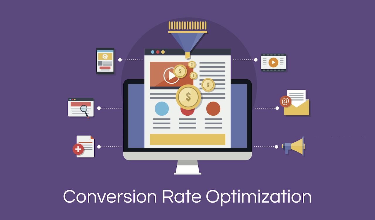
Typically, the conversion rate is the number of onboard customers from the total number of visitors on your website.
The average percent of this conversion rate is 2 for every 100 visitors.
But, you can have more than this average.
It is possible.
Here are a few quick ways to increase conversion rate on your website:
1. Have a pop-up ad on your website
A pop-up ad is a type of online advertising over the internet. Usually, a small window suddenly opens in the foreground of the web page, which may be a call of action to sign up or subscribe to or anything else.
People opt in this advertising because it is a quick way to increase conversion rate on the website. On an average as per a study, pop-ups achieve 3.09 percent conversion rate. But, this is not a standard. With the right digital marketing strategy, you can make it up to 9.28 percent.
To achieve the highest rate of conversion, follow these golden rules:
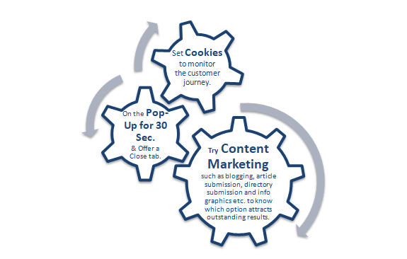
These three rules will get you the highest number of conversions with lesser bounce rate and more benefits.
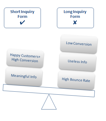
2. Keep inquiry form short
Customers dislike filling information in more than enough fields in the inquiry form. The best idea is to remove the unnecessary fields. Keep what fulfils your interest and objectives.
Don’t have any idea about which fields to cut off?
Try A/B testing on form fields.
Certainly, this idea would make your customers and you happy.
A website viz. KISSmetrics got amazing results when it removed a few trash-like fields and signups. The signups improved by about 10%.
But, don’t skip gathering useful information while cutting off fields. So, keep informational fields up and running in the form.
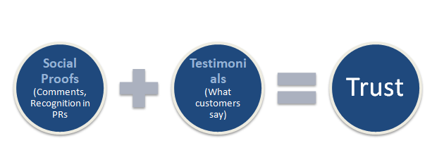
3. Add what your happy customers say
It’s really hard to get your first customer onboard. A review can make it easy because the potential customers first look at the reviews from the past customers. Their satisfaction is a silver lining for them.
Now! You need to find out what make people hook to your brand and start trusting. These can be any of these:
4. Avoid distractions
Distraction is what prevents your visitors from taking your desirable action, such as clicks, on your website. Large navigations that cover up a lot of screen space, distracting fonts and colors, moving images/text, boxy content design, misalignment,minimal margin, cramped fields & labels, secondary messages without information and additional call-to-action (CTA)- these are a few things that visitors don’t like.
So, keep the landing pages free from any noise and distraction. It should be clear, concise and easy to navigate. Remove inessential things. Keep up with what customers want to know more.
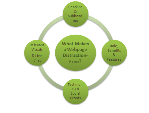
Google analytics or any other analytics tools can also prove handy in determining distracters. Identify where customers clicked and maximum number of them bounced out. It will give you an exact idea of all major distracters.
Delete them and then, measure. Your conversion rate would be higher.
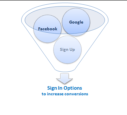
5. Multiple signup options
People don’t prefer to login with a fresh email address. Make them happy by offering a third-party signup service. It’s a trend these days.
This third party signup option is a relief for those who don’t want to create a new profile from scratch.
Offer them to use their Google, Facebook, or other account.
This option will help save time for users, who would feel more likely to sign up and see your offers.
Delete them and then, measure. Your conversion rate would be higher.
5. Multiple signup options
People don’t prefer to login with a fresh email address. Make them happy by offering a third-party signup service. It’s a trend these days.
This third party signup option is a relief for those who don’t want to create a new profile from scratch.
Offer them to use their Google, Facebook, or other account.
This option will help save time for users, who would feel more likely to sign up and see your offers.
6. Come with a Strong Call-To-Action (CTA)
Sign up or Start Trying Out or Subscribe NOW-these are a few typical CTAs that may not live up to your expectations in terms of converting a lead.
Think deeper and come out with a very strong CTA that is hard to resist.
Find a positive phrase, like Yes, I Like To Buy!
Make sure that your CTA rightly goes with your conversion goals.
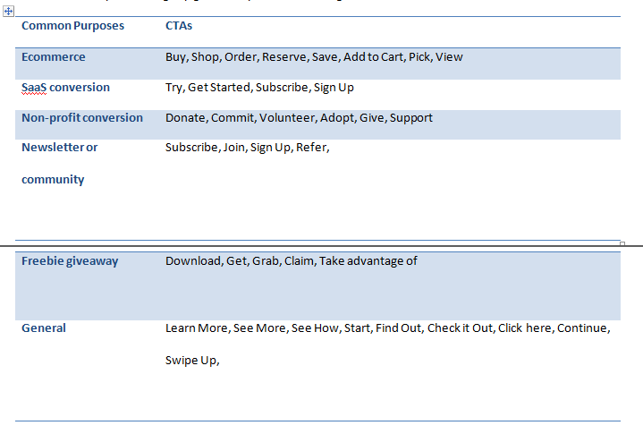
Try adding the magical word-Yes before them, such as
Yes, I Want to Shop!
Yes, I Want to Learn More!
Certainly, I Want to Download!
You can go with A/B testing before introducing a positive CTA with typical one.
The difference will be certain.
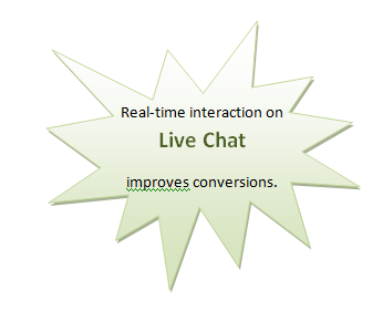
7. Integrate a Live Chat option
A live chat is the online customer service software with online chat. Many businesses have been using it for a customer support, as helpdesk software and to know customers’ web journey.
These are the perfect method for taking real-time queries, doubts and solving them in no time. The happy customer would immediately get a valid reason to get converted.
Yes, I Want to Shop!
Yes, I Want to Learn More!
Certainly, I Want to Download!
You can go with A/B testing before introducing a positive CTA with typical one.
The difference will be certain.
7. Integrate a Live Chat option
A live chat is the online customer service software with online chat. Many businesses have been using it for a customer support, as helpdesk software and to know customers’ web journey.
These are the perfect method for taking real-time queries, doubts and solving them in no time. The happy customer would immediately get a valid reason to get converted.
8. Set stage for pre-selling
You need to do a lot of study and get deep with how to strategically map out customer pitching before a sales interaction,
You have an incredible option called video marketing. Make it live on the platform where your customers visit more often.
Adding a testimonial or launching a white paper can also do a great job.
New buyers often want to look at the quality of your service or product. These two can help them to measure it pre-selling.
When you intentionally map out how to presell, you can easily improve your closing rate.
9. Communicate about the product/services
The buyers are smart today. You cannot make them fool with a small piece of information. They want to know more than enough about what you sell.
Otherwise, the visitor won’t be convinced. So, do check if you have integrated enough description of what you sell. Up to 50% of potential sales are not converted because of very little or inadequate details, as per IDC, a global research company.
You can display some pictures, videos and reviews of your products or services. This tweak will certainly help you to get more number of customers.
10. A/B testing of landing pages
This testing is a process of measuring which one out of two variants of the same web page is performing better.
A wrong approach while designing and aligning content to the landing page can bounce out all leads. They simply hit the close button to look for another option.
Here are a few points that can make your landing page a winning platform.
- Check for the length and context.
- Check tone of what you want to convey.
- Check statistics, as how you are using it.
- Check the use of numbers, as if they are correct.
 RSS Feed
